Wednesday, 5 May 2010
Monday, 29 March 2010
Friday, 26 February 2010
Monday, 22 February 2010
Evaluation 1
.
In our media production we developed and challenged forms and conventions. We developed them as it makes it easier for our audience to denote it as a horror genre and challenged them to make it a more individual product and stand out from other horror films however, it is difficult to make the product individual as living in a post modern society ideas are mostly re-used and recycled.
I researched the horror genre by using sources such as IMDB, wikipedia and google. I also watched the trailers on Youtube. I found out from my research that the horror genre uses many stereotypes such as a 'blonde scream queen bimbo' and an 'intelligent final girl brunette'. Also, the killer is predominatly a masculine tall male. After deciding the narrative for our trailer we chose to challenge the codes and conventions by having a female brunette killer. I noticed from my research how important music on the trailer was as it helps set and change the mood for the audience between different scenes. The mood throughout most horror films is a dull dark mood which is created from the music and also through colour. The most common colours are red, black and white which are specifically chosen. In the majority of horror films the weather is dull and rainy which is used to put the audience in a sad mood. This is seen in Gothika Mathieu Kassovitz 2003 trailer. However, in the Donkey Punch trailer it is set on a holiday island and the weather is sunny which the audience will associate with being happy. This may have been used to trick the audience into thinking it wasn't a horror film.


We used a binary opposition which is commonly used between the protagonist, who is a brunette and the 3 blonde characters as when they are all sat in the bar the blonde girls dominant the shots and there is a juxtaposition to the one brunette girl with the hair colours.
Also, when the protagonist and her friend, Sophie enter the bar Sophie recieves the attention from the group especially the male while Lucy goes virtually un-noticed. We did this to make the audience feel sorry for her and throw them off the track that she is the killer.
I feel we have challenged codes and conventions by having a female killer as this is an uncommon trait in horrors. Although, in the Kill Bill (Quentin Tarantino 2003 and 2004) films they have developed this even further by having a blonde female killer. I think this is what most horror films are going to do now as the audience are starting to guess the character types to easily and therefore uncover the plot. So the audience may be more inclinded to what a horror film where there is more suspense as they are unsure until the end who the killer is.

Theos character is also similar to Clay Miller from Friday the 13th (Marcus Nispel 2009) as he is a tall dark haired character who remains alive until the end of the film. Although Theo appears as a 'player' in the bar scenes by flirting with 3 attractive blondes, when he turns down the protagonist he says 'i like someone else' which shows that he does have loyalties to another girl and isnt as shallow as he is initially portrayed to be. This could make the audience think that he may not die after he has said that comment as in most horror films the victims are seen to 'deserve' to die and this comment makes Theo seem like he is a nice person therefore not worthy of being killed. On the other hand, the 3 girls in the bar are portrayed as flirty and sexually active so following the codes and conventions of horror films, they do deserve to die.
We used a brunette female killer as dark colours signify death, evil and wrong-doing which this character then goes on to be the murderer in the trailer. Female audiences especially feminists may like the brunette female as she has a strong character and is in control of the situations which she is seen in in the trailer. A false sense of security is created around the protagonist as the audience wont initially suspect her, resulting in when the killers face is revealed it surprises the audience and could lead them to doubt people in future situations.


Our second killing occurs in the shower which is an intertextual reference to Dressed to kill and Psycho as both of these films feature a killing in the shower. Both Janet Leighs character from Psycho and Fran from our trailer are both attractive blonde females which creates more of a link between the 2 characters as they look similar which the audience could relate too. We decided to use this location as the character is in a vulnerable position. Also, the majority of our audience will be male teenagers and having a female appear naked in the shower, the sexual aspect will appear to them and entice them to go watch our film after seeing the trailer.
In our trailer there is no authority figure which is a common code and convention of horror as they have featured in films such as Last house on the left (http://www.youtube.com/watch?v=sl2lmFPBGN8) , Prom night (http://www.youtube.com/watch?v=N_7JKWRWnkU) and Halloween (http://www.youtube.com/watch?v=0I0YbRxoWlU) as the form of parents or police.

The legacy of blood by Jim Harper controversially argues that the virgin as a final girl and sexually active female as the scream queen has been abandoned in horror films for some time. There are a minority of films Candyman, Blair witch project and Paranormal activity which do not have a final girl and in Candyman and Blair witch project all of the characters die which is unusual. Although Paranormal activity can be seen as an expectation as it is an extremely low budget production and only has 4 characters (2 males and 2 females) there is neither a final girl type or a scream queen in this production.
However, the majority of horror films, including classics such as Halloween and Donkey Punch, include a final girl as this means there is scope for a sequel and so the final girl can reveal indirectly to the audience by telling her family or the police about what happened and who the killer is.
All of the characters in our trailer have Yorkshire accents, we are aware that this may limit our appeal to a wider audience such as a Southern England audience and an American audience as Americans associate the southern England representation with English people as a whole so our Yorkshire characters may confuse them. We didnt purposely choice to have our characters speak in a Yorkshire accent, it was the only availablilty of characters to us. Also, there are some films such as 'The full Monty' and 'This is England' which have been successful and feature Northern characters. If we had a bigger budget than we could have used professional actors who wouldnt have as strong Yorkshire accents as our current cast do.
We decided to have lots of clips in our trailer to establish the plot and communicate the genre to the audience, similar to Donkey Punch (Oliver Blackburn 2009)
http://www.youtube.com/watch?v=J6kxswnHn3c Valentine (Jamie Blanks 2001) http://www.youtube.com/watch?v=dA-koJi7wVU
Unlike films such as The Unborn (David S Goyer 2009) http://www.youtube.com/watch?v=sc3Cba0qOco whose trailers give less of the narrative away.
My research showed me how vital music is too the trailer as if used properly it can create great suspense to the audience. In our trailer the music comes in once the protagonist puts a CD into the CD player. This is similar to the Scream trailer as there isnt music on the first few shots and it also reflects our youthful target audience.
The voice over that is featured on our trailer is a males voice which is a common code and convention of horror. We could have challenged this by using a females voice which may have fitted in more with our trailer as it is a predominantly female cast although we thought a males voice seems more stereotypically scarier as it is deeper than a females. We used the voice over to give exposition of the narrative but we didn’t want to give too much away.
We also ended our film with a shock image which is a code and convention of horror films.
Evaluation 4
Throughout the production process we published all of our research, planning and evaluation on a blog which we created from http://www.blogger.com/. It was really simple and reliable to use and had many features such as being able to upload video, images, embedded documents and show links. As it was all saved over the internet I could work on and my blog at any computer at home or school and all my work would be saved which meant I could use my time productively and wasn’t limited to only do my blogging at school. Blogger also seemed to have an unlimited capacity. However, it did have some faults as if you uploaded a video clip you had to make sure it was working and sometimes the videos played but if I checked them again they wouldn’t play which became annoying as I never found a cause for this. To embed documents I signed up with http://www.scribd.com/which is a free website that enables you to upload document and post the link on your blog which meant it was embedded in that post so it is easy to access and analyse for the rest of the group or examiner. I scanned in the documents first and then used scribd to embed the documents onto my blog such as the storyboard, production schedule and screenplay. http://johnson-lucya2.blogspot.com/2010/02/revised-storyboard.html.

To research films I used websites such as http://www.uk.filmtrailer.com/ to view numerous trailers which helped me create my idea and follow the common codes and conventions of the horror genre. I regularly used http://www.imdb.com/ to research particular films as it gave detailed information on things like plot, trailer, budget and gross revenue and much more. The website was clearly layed out and easy to navigate. http://www.wikipedia.org/ also was useful in giving me definitions and basic understandings of topics and theories such as Maslows hierarchy of needs which I applied to my audience. http://en.wikipedia.org/wiki/Maslows_hierarchy_of_needs

I feel I have improved my directing and editing skills although I could have improved them more by using final-cut as it is an updated version of the programme I used, imovie. We had initially decided to use final cut however, time was running out and we thought as we were unaware of the features of final cut it may take to much time and our product could suffer because of this. My practical skills improved as I know have a deeper understanding of different framings, angles and movements and the purpose they are used for such as a dutch angle is used to create the sense that something is wrong. I noticed that when I use the camera the shots are a lot less shaky than in last years coursework especially when tracking a character or zooming in which meant that filming was less time consuming as we didn’t have to re-film due to a gilt in the camera. Although, we used a jerky camera in one scene when it was a point of view shot from the killers view as she opens the door and attacks Sophie. We used this shot as it is mean to be the ’eyes’ of the killer and that it is what it would have looked like to them. Doing this adds to the scariness of the shot and builds tension. However, there is one shot in our trailer where the camera jerks when it isn’t meant to, when you see the wine bottle being smashed the camera jerks when the wine bottle hit’s the ledge. We did re-film this scene but again the angle we filmed it from wasn’t right so it is hard for the audience to tell that is a wine bottle smashing as the clips only lasts a matter of seconds.

We used a digital camera to take pictures of the cast and I also used a digital camera when producing my anamatic at the beginning on the coursework task. Using a digital camera meant I could upload the photos onto my blog a lot easier and quicker than if I scanned them into the computer then uploaded them with www.photobucket.com which I used last year. Also, as I regularly use digital cameras socially so I am well aware of how to use a digital camera so there was no time wasted coming to grips with the features and generally how to use it and upload the photos to a computer.
I have developed my skills of photoshop immensely since last year as last year when producing a poster it took a huge amount of time as I had never used photoshop so I was trying to come to terms with the features whilst creating a poster to a high standard. So this year when I was making the poster and magazine I was able to use my time more efficiently as I was aware of some of the buttons I could use although I still probably took more time creating my magazine cover and poster than others who used photoshop on a regular basis. I am glad I know have a basic/moderate understanding of photoshop as it is it a programme which is used in industry so hopefully the products I have created wouldn’t stand out too much if they were compared with products made professionally.
such as; http://www.pegaweb.com/
http://graphicssoft.about.com/od/photoshoptutorialsbasic/Photoshop_Basics_Tutorials_for_Photoshop_Beginners.htm
http://www.photoshopstar.com/effects/cool-effect-for-your-designs/
I found the second link especially useful as it was a video link so it was visual making it more easier to understand. I didn't use all of the information i learnt from my research as not all of it applied to a magazine cover, however if I needed to use photoshop for something else then I would be able to apply my knowledge then.


Throughout filming we kept the same digital video tape just in-case our footage was lost on the MAC computers so we had a backup file and wouldn’t have had to re-shoot if we lost the footage just re-edit it. We also kept the same tape as we new there was no problem with that tape as sometimes the tapes can malfunction which would make things very difficult if this happened during filming. We also made sure our battery on the camera was fully charged before each filming experience as if we were filming outside or somewhere where we couldn’t plug in our camera to charge this would have wasted time and annoyed our actors which we didn’t want to do. We tried to re-use the same camera each time as they varied slightly in terms of models and we didn’t want to upload our footage and notice the person before had altered the settings of the camera such as changing the standard 4:3 to widescreen 16:9 or putting the camera in night mode but not changing the settings back after use as this could have caused problems once we had filmed the footage as you would only notice the differences once you started editing and adding it to footage you had already filmed.

I only started to use MAC computers when I started the media course prior to that I had only used PC’s. Initially, I found the MAC computers confusing but looking back I think this was because I wasn’t used to the change as quickly became used to the MACs and found they had advantages with their use over a PC such as being able to open up more than one internet page and view them all at the same time. This was useful if I was quoting a source as I wasn’t having to flick back and forth. We did the editing of our film on the MACs at school but like I mentioned earlier, as you can access you blog on any computer I used the PC at home to write posts for my blog.
Over the past few years there has been a large development in the use of social networking sites such as http://www.facebook.com/ and http://www.twitter.com/. I uploaded my ancillary tasks and main product onto face book as it is a fast way to gain audience feedback. A few years ago I would only have been able to gain audience feedback by simply showing my products to my potential audience face to face and asking for their feedback that way. Gaining feedback over the internet means my audience can be more critical and honest and it stops there being a researcher bias where they say things they think I want them to say. I could have developed this more by uploading it onto http://www.youtube.com/ as it is a dominant provider of online video and holds a 43% market share.
We used a portable digital audio recorder to record our pod casts which was showed how far we had got and things we were planning on next. We also used the recorder to record the voice over on our trailer which says “this Christmas”. We used this feature as it is a common code and convention to have a voice over.
Throughout my blog I have added videos, embedded documents and images to make it more visually appeasing for the audience. Overall, I feel I have developed my skills of new media immensely since AS and they carried on developing throughout the coursework task. Without new media the majority of the research I conducted and the production itself wouldn’t have been possible.
Evaluation 3
My original idea was ‘A group of teenage boys and girls go camping on a dark moor in the middle of nowhere. They stay up all night drinking and then start to experiment with a variety drugs. After a while, they start hallucinating and becoming paranoid, the side effects from the drugs, about what they can see and hear outside the tent. A small group go investigate and leave the majority behind but they find it funny to play jokes on the rest of there friends. The group left in the tent are scared for the others out looking, not knowing its actually them playing the pranks, so they split up into groups and head out. Still influenced by the drugs, all the groups are becoming scared as there out in the dark and cant properly see what's going on around them. They find a body but cant identify who it is or whats happened to her as its so dark, they all start suspecting each other so tension and arguments begin to arise within the group. Throughout the film as the drugs are having a stronger effect and taking over the shots are increasingly from point of views so you don't know if its real life or hallucinating.’

Once deciding on groups we discussed ideas further and combined ideas taking aspects from each which would be most successful.
Throughout the process we continually asked our target audience for their views on ideas or footage we had taken. We would then reflect on what they had said and improve it if possible.
We originally thought we could show a clip in black and white to represent a different time period of a young girl seeing her mother and father arguing over her father cheating on her mother. We thought this could be an added motive for the protagonist killing the girls as she has already experienced relationships when people cheat on each other. Including this would mean we could have also shown an authoritive figure however, when we told our audience feedback about this they didn’t like the idea as it seemed to confusing and being rejected by the male was enough of a motive for the killings.
Our audience feedback helped us on parts of our trailer such as when the protagonist Lucy cuts her leg shaving there was a shot of her shaving her leg and then the next shot was of her leg bleeding and we were intending on putting a voice over of her saying 'ouch' but our audience feedback told us if we added another shot in the middle of Lucys reaction to cutting her leg then this would create a 'shot reverse shot' therefore including more shot variety.
In one of our first drafts we wanted to show straight away that Lucy was a sexually active character so we included a conversation between her and Sophie saying how she wasnt sure which boy she fancied and then listed 3 names. Doing this lets the audience know she is a 'slaggy' character but our audience feedback made us realise that a trailer needs to be quick shots and including this makes the shots too long.
In one of our draft cuts we had Lucy and Sophie meet Tom outside the bar who was Sophies boyfriend who says ‘ iv got a friend for you mate’ this was to show that Lucy and Sam are on a pre-set date. After showing this footage to our target audience they felt this clip was unnecessary as you can establish Sam and Lucy are on a date by the location of being in a bar. Also, when we were filming this clip is was raining, windy and dark which made the sound on the clip hard to hear. After we had taken this clip out it meant there was 1 male character and 4 female characters which may mean males are less interested in our film as there are less characters to relate too.
After we had made changes to our trailer we asked our target audience for feedback again to see whether they had liked the changes we had made. Emily, gave us some positive feedback as she told us she “liked how we had re-filmed the bedroom scenes and there was now more shot variety than before which created tension and was more fast paced”
One of the main problems our audience told us about our trailer was there needs to be more narrative enigma around the killer. Looking back we could have done this by having the killer wear a mask, gloves or hat as in one of the killings you can see the back of the killers head and see her brown hair.


http://www.blogger.com/post-edit.g?blogID=1645392058161487385&postID=5160553765919682563
(link to specific audience feedback taken throughout the production process)

After showing our poster to our potential audience we decided it would look better if you could see the actors on the sofa but then have a black background behind them were we could add text and other images. So using the magic wand tool we edited out the background. Our audience feedback also told us to move the billing block to the bottom of the poster instead of the top as this is a common code and convention of horror posters.
We also decided we needed something to signify it is a horror genre (although the font used for the tagline is a specific horror font we thought we needed more) so we took a photo of a hooded figure, eyes and a hand holding a knife.


We took all 3 photos so we had a varied choice of photos we could use. We asked our target audience whether they liked the images we had taken and which ones best and why. From this we decided to use the hand holding a knife as this is a phallic object and links into the narrative of the trailer as one of the victims is killed with a knife. We didn't use the hooded figure as the image isn't dark enough and you can see too much of the actors face. The image of eyes is one that we used as is gives a aspect of msytery as you can only see her eyes and not the rest of her face, it also gives a sense of 'being watched' .
The updated poster with the billing block moved to the bottom, reviews at the top and the bloody hand holding a knife.
Magazine cover
We made two different copies of magazine covers and changed them after our audience feedback told us our first one didn’t look like a typical magazine cover due to factors such as;
the masthead is too small and doesn't fit across the top part of the magazine.
The blocks of empty spaces should have been filled up with text and the text is predominatly on the top half of the magazine instead of being spread out evenly.
Needs to include more detail about other films which were also being released.
The edges of the image need to be edited more cleanly and less jagged.


In the second magazine cover we predominantly used black and red colours to signifiy blood and death which ties into the horror genre and the audience will associate these colours with the genre too. I applied alot of my research to the new poster by looking into the language used such as 'trouble on set' however, it may be difficult for the audience to make the link between 'trouble on set' and the exclusive with 'A date from Hell'. Also, the majority of magazine covers had a 'must see movies section' so I added this to the magazine to make it look more realistic and it gives the audience a taste of what to find inside if it was a real magazine.
Overall, I feel the second magazine cover looks alot more realistic and has more similarities to actual film magazines. However, if I was to do the magazine cover again, I may add a 'film-strip effect' with a variety of clips from the film as this is commonly used in industry. I would also apply the 'rule of thirds' by having the features of my film on the right hand side of the cover, the picture in the middle and the general features of other films on the left as this follows the audience reading the cover from right to left while my cover is the other way around.
Evaluation 2
How effective is the combination of your main production and ancillary texts?
Our ancillary tasks were to produce a film poster and a magazine cover. In industry there wouldn’t actually be a link between the film poster and the magazine cover unless they were both owned by the same conglomerate such as Twentieth century fox productions and Sky’s subscriber magazine. However, we did still create continuity between the ancillary tasks and our production.
There are a number of different ways in which we created continuity between the ancillary tasks and final production. Although, there could have been more factors used to create a greater effect.
We created both the poster and magazine cover on photoshop elements. I am pleased we used this programme as this is what they use in industry which makes it easier for us to produce products similar to those produced in industry.
My research showed me that a teaser poster is used to slowly build awareness of your film to the audience. We used a single image of the protagonist from behind with a cocktail glass with blood dripping from it in her hand to do this. We also highlighted the colour red in our teaser poster by having a black and white image but having the protagonists dress and hair red. We did this as we didn't want to confuse the audience into thinking it was of the rom-com genre as the title ' a Date from hell' could be a bit misleading. Once the poster for the film comes out there is more information on it such as various images, release date and reviews. From this the audience should be able to tell the genre and maybe guess at aspects of the narrative.
Firstly, we created a poster that had the original image from our teaser poster on it with added stills from our trailer down the side. (http://johnson-lucya2.blogspot.com/2009/12/poster.html)
However, after reflecting on this we decided it wasn’t produced to the best of our ability with the photoshop skills used as the stills down the side weren’t cut out very neatly which made the poster look very amateur. Even though having the same image on the teaser poster and poster creates continuity and once the audience has seen the teaser poster and then the poster they may recognise the image and remember the film, we decided to start the poster afresh.
 The image on our poster is a photo of the protagonist taking a photo of the group that meet in the bar. As you cant see the protagonists face, just the back of her hair, this creates narrative enigma for the audience. This also links into the teaser poster as you can only see her face from the side which the audience will recognise. We chose to use this picture as it links into the title of our film ‘A date from Hell’ as you audience will notice that the set up of the characters in the bar is similar to what will happen on an actual date. Going on dates is a common thing which the audience can relate to, which adds to the scariness of our production as the protagonist appears to be a normal teenager at the beginning of the trailer but then turns in to be a murder which is unexpected and brings it closer to home for the audience as next time they go on a date it could make them worry and think twice about the person they are meeting.
The images on the poster connote both violence and sex from the signifiers from the knife and the eyes and sex is signified from the actresses dressing provocatively in tight, revealing clothes. Both of these themes link into the narrative of the film.
Even though the knife and eyes connote the horror genre we could have anchored this more by having a picture of the protagonist from a low angle to make her look more powerful and domineering or a picture of the victims faces looking terrified. However, not being able to see the protagonists face creates narrative enigma and the audience hopefully will pick up on this and wonder why she is the only character who you can’t see and why she hasn’t been invited into the photo as she is the one taking the photo.

We decided that the BBFC would rate our film a ‘15’ which is featured on the poster. We decided it would be a 15 for the reasons of it including scenes of a sexual nature and intentional violence without humour. The BBFC is the national governing body for films released for public consumption in the UK and Northern Ireland. Also, our research showed us similar horror films within this genre are also rated ‘15’ such as Prom Night, Donkey punch and Sorority Row.
 (This poster has similarities to ours as it is all girls and is predominantly girls, some of there faces look scared while some look confident which connotes the variety in character types, the burning house in the background gives anchorage to the setting, the film is being released on September 11th which is an important day in America)
We chose to have reviews from Kingdom, which is the magazine we created, The Sun as our potential youth, lower class audience may also read The Sun therefore agree with how they describe our film and it may make them go see it. http://www.thesun.co.uk/sol/homepage/showbiz/film/
We also had a review from Jonathon Ross to appeal to a wider audience as this would appeal to the middle class older audience as he is a typical ‘BBC’ middle class, well spoken character.


Originally, we thought our poster should just have the photo of the group in the bar although, after showing this to our potential audience we realised the audience would most probably not associate it with the horror genre so we added the photos of the eyes and knife. The poster without the knife and eyes could have been successful as a teaser poster but not for the real poster so I am glad we showed it to our potential audience and received their feedback to amend this.
The initial magazine cover was a still from the trailer of the protagonist looking upset. (http://johnson-lucya2.blogspot.com/2010/02/film-magazine-front-covers.html)
Similar to the initial poster, the magazine didn’t look professional so we decided to do another copy of that too. I continued my research and found that it is uncommon for magazines to have a still from the film as there photo so I am glad I decided to do the magazine cover again.
We wanted the face of the protagonist to stand out so the image of her face dominants the picture and it is also centred on the magazine cover, which is a common code and convention. The title of our film was also a key feature to the magazine so we put this in a large red font to stand out against the black background and red is also a colour which people link to Horrors. We decided to have our magazine a purely horror magazine which was shown by the font used to write Kingdom (we downloaded the font from http://simplythebest.net/fonts/ as we wanted a font that portrayed horror which this one did) and the tagline reads ‘the ultimate horror magazine’. We chose to have it as a purely horror magazine so it links into the well known horror magazine ‘Fangoria’.

On the poster and magazine cover the font used to write ‘a Date from Hell’ is the same on both of them and they are also of a similar size. They both also feature heavily red writing and both images are on a black background. On the poster the magazine ‘Kingdom’ has also been quoted which creates continuity.
We could have created continuity more by having the same image on both the poster and magazine cover, however doing this would have made it more difficult to show off our photo shop skills but it may have made it easier for our audience to recognise the film.
The video above visually shows the parts of photoshop that we used to create our magazine cover and poster.
the video above visually shows the links between the ancillary tasks and our final trailer which i talked about above.
Wednesday, 17 February 2010
Soundtrack

We downloaded the 2 'packs' proscores and dsfx.
Proscores had the tension building elements such as Percussion, Choir and Orchestra.
Dsfx is divided into 5 sections:
- Impacts
- Swishes
- Drums
- Ambience
- Abstract
 The soundtrack to our trailer starts when you see the protagonist press play on a CD player. The music starts which is fast paced and 'techno' which links into the narrative of the 2 girls getting ready to go out. This is also an intertextual reference to Donkey Punch as they used a similar techno piece aswell. There is then a sharp change in the music to add to the effect of how the narrartive is changing, the music becomes slower as it builds more tension just before the murders are shown and the last shot when the protagonist turns around there is a 'boom' noise to add to the shock of what you have just seen. We also thought that a variety in the music used would show were trying to target as wider audience as possible.
 Casting
 We decided to use Lucy as the protagonist in the trailer as she is a group member we knew she would always be available for filming. We decided if we used a brunette as the protagonist the audience may see her as the 'final girl' type so not to guess the twist in narrative that she is actually the killer. We thought they may relate her to Lauire Strode from John Carpenters Halloween.
 To the left is the male charracter used in our trailer. He was our second choice for our production as we had already filmed previous shots with another boy, Sam, but when it came to re-filming Sam was unable so we decided to use Theo and refilm all of the shots Sam was in previously as we needed more shot variety. We thought that as Theo is a tall dark haired boy the audience may suspect him as the killer in the trailer as oppossed to a baby-faced blonde blue eyed boy.
We didn't hold a casting audition as we didn't have that much choice over which actors we could use due to people generally not wanting to act or having other commitments.
We based our narrative around 17-18 year old characters as we knew it would we easier to find characters of this age rather than younger or older as we could act in it ourselves our ask our school friends.
The demographic of our cast are white, middle class, hetrosexually- represented. However, this doesn't mean that our production doesn't appeal to the minorites as many productions sideline minorites but our still commerically successful.
All of the cast have Yorkshire accents however the Yorkshire stereotype of farmers, feilds and rural is not featured. The audience may see similarites to our actors accents to those used in Donkey Punch as they had Northern England, Leeds accents.
Software
above is a link which is a step by step guide to the editing process which I found helpful.
On imovie you can add titles to your production which we used to have reviews, release dates and captions. We used these as they make it look more realistic as it is what you would expect to see on a real film trailer.
I found that you can change the speed, font, size and colour of the transistions. We decided to have our transistions red writing on a black background to convey a horror theme.
 We also used the video effects that imovie has to offer.
 You can add a soundtrack to imovie and you can either create your own original piece by using garage band, import the soundtrack from a CD, itunes libary or imovie has a selection of soundtracks you can add. After using garage band last year we decided we would download our music from a copyright free website.http://www.videocopilot.net/ You can add more than one track such as we have used a techno beat at first and then it changes into a slow paced to fit in with the narrative. There is also the option to start the soundtrack at any point of the production so we decided to start ours when the protagonist press 'play' on a CD player. You can control the volume of the soundtrack which we found useful so we can turn the volume down when there is dialogue which needs to be heard.
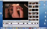 This is what imovie looked like for the majority of our editing. Underneath the main image is the timeline of the clips we had placed there for our trailer and underneath that is the music line. Down the right hand side is the clips that we havn't used in our trailer but have kept to use as roguh cuts or clips we had ' split' or had used initially but after audience feedback, changed them with something else.
 We added transistion throughout are trailer to create more variety to the clips. The 'wash in' transistion was used successfully when you see somebody cutting out a person from a photograph as it gave extra suspense to the shot. With the transistions you can decide what speed they appear at and if you don't like the clip you can easily remove it.
 When adding sound onto imovie you can chose the alter the volume levels of the music or a particular clip. It is simple to do and useful as you can chose to lower the music when you need to be able to hear what the characters are saying.
 The photo above shows when we 'extracted' the audio. We applied this tool in the bar scenes as the external sound is too loud and un-necessary. We also used it as a voice over when you see a close up of the protagonists face with the male characters voice played over. We used this as it is an effective way to show what the protagonist is thinking about and it adds more variety to the trailer then having a close up of the males face saying it.
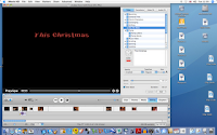
We added titles to our production which included 'this christmas' (this was our release date as with teaser trailers they do not give a specific date) 'be prepared' and others. We used these as it gives exposistion to the narrative through text instead of having a character say it. We chose black and red as it goes with the Christmas idea, red also signifies blood and love while black signifies death. We were able to choose the font, colour, size and how the title appeared on the screen and the duration it stayed.
I found the advantages to using imovie are all the clips are filed together making it easy to access them and easily sift through which clips to use, this basic layout makes it easier for begginers to use.
We took the photo for the magazine and poster with a digital camera and uploaded it onto iphoto were we 'adjusted' the photo slightly to make the photo seem sharper and brighter to stand out more.

This was followed by adding text to the cover in a variety of colours, fonts and sizes to make it look more appealing.
Tuesday, 16 February 2010
Final proposal
We decided to make a horror trailer as we felt we had the best knowledge of that genre and would be the most successful trailer to make. Also, as the horror target audience is our age group (18 years old) we know what works and what is affective. From our research on the BBFC website we have decided to rate our film a 15 as we thought the themes and context could be deemed as inappropriate to a younger audience. Although things like piracy and downloads may make this inevitable, a rating needs to be applied for when it is shown at the box office and for the video store. The source www.sbbfc.co.uk shows the guidelines to which films have to stick to in order to fit into that classification and we also compared it to films similar to ours in terms of the themes language, nudity, sex, violence, imitable techniques, horror and drugs. There is only a small amount of nudity in our trailer; where the 2nd victim is in the shower, she is covered up however it is portrayed to the audience she is naked. We decided to have the character in the shower as it is when she is at her most vulnerable.
The establishing shots are of a brunette and blonde girl (so a binary opposition) getting ready, applying make-up doing there hair, to go out.

We also considered to have a flashback of the protagonist as a young child seeing her mother suffering from domestic violence from her dad, we thought this could be an ulterer motive for wanting to hurt the boy who rejects her.
Revised:
After pitching our trailer to our potential audience and filming some footage we decided to slightly change our narrative.
 After a few shots of the brunette and blonde girls getting ready we decided to have them walking into a bar and over to a table were 2 attractive blonde girls and an attractive boy were sitting. They welcome over the blonde girl but basically ignore the brunette. There is shots of the brunette looking bored and upset whilst being ignored by the others who are all laughing together. The boy asks the brunette to take a photo of the 'group' leaving the brunette out of the photo. The blonde girls leave leaving the boy and the brunette alone together. The brunnette seems happy at the thought of this while the boy looks displeased. She then asks him to go back with her to her house and you see them get into a taxi and kissing in the back of the taxi, he pulls away and asks if they can "wait till we get back to yours". Inside the house there in her bedroom on the bed. You see clothes being thrown in the air and it is revealed that the girl is sat there fully clothed while the boy is topless. There kissing on the bed when he pushes her off and says "can we just stop". The next shot is off the protagonist looking upset with a voice over of the boy saying " I like somebody else". The killings then start to happen (the girls they met in the bar) first a girl being killed in the shower, second another girl being hit with a broken wine bottle and thirdly the initial girl from the establishing scenes opens the door and is forced backwards and strangled. She cries "why are you doing this?" which links into Scream when Drew Barrymores character recognises who the killer is and Sophie is recognising her as her friend. Inter-cut in between the killings is the photo of the group in the bar which as they are being killed off they are being cut out of the photo. The trailer ends with a shot of the brunette girl looking like she has been attacked this is so the killer isn't revealed in the trailer and it would shock the audience as they would have there suspicions she was the killer.
There is also help to overcome factors that might make filming more difficult such as simply youtubing low budget horror movie tips. Many links come up with other people blogging there progress on there horror film and bad things which has occurred but what they have over come.
http://www.youtube.com/watch?v=xR787OYXS7Y
Friday, 12 February 2010
Rough cuts
Whilst filming this clip it was raining and extremely windy which meant we couldn't use the boom mic resulting in the sound being poor.
We originally used this clip to show the clothes being thrown into the air however, we decided to change the angle of the camera as the clothes fly by quickly and it may have been hard for the audience to realise what they were.
This is a test shot of the protagonist. This would have been a good shot to use as it clearly establishes the protagonist, we decided not to use this shot as there wasn't enough time in the trailer for it.
We decided not to use this killing as you can see the killer too obviously stood behind her. This was difficult to shoot as it is hard to make it look realistic without actaully hitting the actress with the hairdryer. Our audience feedback told us that is wasn't a realistic or scary killing.
We decided to film this from behind the protagonist so you couldn't see her face however, we had to re-film as the framing wasn't very good as the protagonists head took up too much off the shot and you couldn't properly see the action going on behind her.
We didn't use this shot as the framing is poor and again it is hard to make a killing look realistic without hurting the actress. Also, you can see too much of the protagonist which loses the narrative enigma of the trailer.