We researched many different types of posters looking at a variety of genres to broaden our knowledge on film posters. We found that the majority of posters had multiple characters on the poster giving insight to the audience. However, films such as Saw and Scream only had one character on the poster.
- Phallic objects are a common convention used in horror films as they link into the narrative of the film. (Dark Ride Craig Singer 2006)
- The male gaze theory is commonly used as it increases the interest the male audience will have in the film. This is done by an attractive female wearing minimal, provocative clothing. (Jennifer's Body Karyn Kusama 2009)
- There is a trend in horror posters that the colours used are predominantly black and red as this connotes blood and death. Blue tint is also commonly used as it signifies supernatural which themes may feature in the film. (The Unborn David S. Goyer 2009)


Our research showed us that posters must include the following:
- A tag-line
- billing block
- Reviews
- Logo of film company
- Release date
- Dominated by images
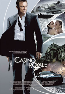
For our poster we decided to use the original image of the protagonist which was on the teaser poster. We decided to do this as a low/no budget film company it makes it easier for potential audiences to recognize our film as the image is repeated. We also added still shots from our actual trailer of the other characters. This is an inter-textual to the James Bond film Casino Royale.
We decided to re-do our poster as we wanted to create a new poster that didn't have the same image as the teaser poster. The steps we took to do this follow. We used a photo which is taken during the trailer to link into the narrative of the trailer.
We uploaded the image and 'adjusted' the image by making the photo brighter and changing the contrast levels.
We used the font 'impact' for the billing block and a font which we noticed was similar to the one's used in 'The Unborn' and 'Dark Ride' for the title font.

We weren't sure whether to have the tagline in a large or small size or for it to go over 2 lines. After writing them all out we compared them against each other and looking at other posters we chose to have the
smaller font.
The font used for the tagline is downloaded of a website which specialised in horror fonts. http://www.1001fonts.com/fonts_overview.html?page=1&category_id=14 we used this website as it had a special compatability with Mac computers.

We then started to add the reviews to the poster. One from a magazine Kingdom (which we created). One from a tabloid newspapper such as the Sun, Daily mail or the Mirror. Also, a quote from a famous figure such as Johnathan Ross as people may see his quote and as he is a respected character, take his word for it being a good film and therefore develop an interest in the film.

After showing our poster to our potential audience we decided it would look better if you could see the actors on the sofa but then have a black background behind them were we could add text and other images. So using the magic wand tool we edited out the background. Our audience feedback also told us to move the billing block to the bottom of the poster instead of the top as this is a common code and convention of horror posters.
We also decided we needed something to signify it is a horror genre(although the font used for the tagline is a specific horror font we thought we needed more) so we took a photo of a hooded figure, eyes and a hand holding a knife.


We took all 3 photos so we had a varied choice of photos we could use. We decided to use the hand holding a knife as this is a phallic object and links into the narrative of the trailer as one of the victims is killed with a knife. We didn't use the hooded figure as the image isn't dark enough and you can see too much of the actors face. The image of eyes is one that we used as is gives a aspect of msytery as you can only see her eyes and not the rest of her face, it also gives a sense of 'being watched' .

The updated poster with the billing block moved to the bottom, reviews at the top and the bloody hand holding a knife.
Above is our film poster.


No comments:
Post a Comment