Tuesday 15 December 2009

Target audience and (notional) bbfc classification


  • Our product is target a 15-24 year old audience so decided to rate our film 15 as the themes and context could be deemed as inappropriate for an audience which is any younger. We are targeting this age range as the characters in our production are of this age and it is also being produced by people who fit into the age category.
    The source www.sbbfc.co.uk showed us the guidelines to which films have to stick to in order to fit into that classification and we also compared it to other films similar to ours in terms of themes, language, nudity, sex, violence, imitable techniques, horror and drugs. Following bbfc guidelines we made comparsions from our trailer to other trailers believe it fits a 15 classification.

  • Our production doesn't include any non-Caucasian characters. However, this does not mean our text only targets a narrow Caucasian audience as many other productions continue to sideline non-Caucasian talent and still are successful such as Donkey Punch, which is a successful british horror which just features white characters. Our teaser trailer has therefore gained a hegamonic status.
  • Horror films are seen as a male dominated genre which is shown by all horror films using the male gaze theory to attract to the male audience to attractive characters used. We have also followed this code and convention by using 4 attractive blonde females in our production. Although, to avoid only appealing to half of an potential audience horror films generally feauture a tough, resourceful final girl character. Shown in Halloween with Laurie Strode. However, in our trailer we have not used a final girl . Eventhough horror films are typically a male dominated genre we didn't want to alienate half of our potential audience by ignoring females so the cast is predominatly females. This means that the female audience can relate and emphasis with the female characters.We considered the movie-as-date factor as the couples going on dates are predominately teenagers so even though horror films target males more, there needs to be characters which the female audience can relate to. The character females relate could be Sophie, the first blonde girl who doesn't get killed. This is because she is an attractive female who isn't portrayed negativly like the other girls are. In our trailer there are no obvious characters who would bring in the pink pound audience, however the 2 male characters may interest the pink pound as they could find them sexually attractive. 

  • From our research into Horror films we found that most horrors are aimed at C1C2DE. As it is using middle class characters and a middle class setting this will also guarantee a middle class audience. To bring in ABC1s we could have used more sophisticated characters such as a adult for them to relate too. Even-though Northern films struggle a lot at the box office we still decided to keep with the northern accents and settings. However, there is advantages to using southern English characters and settings as it has an hegemonic status. Films such as Notting Hill, which is set in London, makes it accessible for a UK wide audience to relate to as its the capital of the country, therefore making it successful. Using northern England stereotypes could jeopardize the foreign sales as the southern England stereotype is normally the one given out to other countries. But there are successful Northern films which have overcome this such as Full Monty and This is England as the main themes in the films are accessible to all audiences. For example, the main theme in the Full Monty is unemployment, and the main theme in This is England is Thatcherism ( a prime minister which has been described as a dictator) Warp X and Redwave films chose such broad themes as everyone can associate to a time where they or there country has been unemployed or had a high unemployment rate, and the audience all know of a country which has had trouble due to the countries leader. After considering our options, we still decided to keep to keep our northern accents as we don't see it as a great problem. Also, if we had decided to use southern accents, then there would be the problem with finding southern actors or the characters accents sounding realistic.
We would expect our target audience to be interested in films which are similar to ours, especially the horror classics. Such as Halloween, Scream and Friday the 13th. This may be because these films are the ones that got our target audience interested in horror films in the first place. Our trailer is linked to these films as the cast/characters are all of similar ages and there are numerous killings throughtout the films.
  • Warp X could be a possible distributor of our film as they specialise in regional films with a lower socio-economic grouping, such as This is England. These factors tie into our film as is it set in Yorkshire. WarpX also deals with low budget production methods to make high value movies that can reach cinema audiences across the world.

  • Psychographic profile of our audience would be a teen/youth audience.
  • Maslows hierarchy of needs is a pyramid system with a hierarchy of motivation. The levels must be completed before a state of self-motivation is reached. Maslows hierarchy of needs applies to my target audience as it they are most likely to be in the safely and security and love and belonginess levels as they may not have a steady job or relationship which they can relate to the characters in the film as they have relationship problems too therefore lack self motivation and are unable to move on emotionally.

Assessment criteria

Sample Marking Criteria for Unit G324: Advanced Portfolio in Media
Level 3 12–15 marks
There is proficient research into similar products and a potential target audience.
There is proficient organisation of actors, locations, costumes or props.
There is proficient work on shotlists, layouts, drafting, scripting or storyboarding
Time management is good.
There is a good level of care in the presentation of the research and planning.
There is proficient skill in the use of digital technology or ICT in the presentation.
There are proficient communication skills.

Level 4 16–20 marks
There is excellent research into similar products and a potential target audience.
There is excellent organisation of actors, locations, costumes or props.
There is excellent work on shotlists, layouts, drafting, scripting or storyboarding.
Time management is excellent.
There is an excellent level of care in the presentation of the research and planning.
There is excellent skill in the use of digital technology or ICT in the presentation.
There are excellent communication skills.

Marking Criteria for Evaluation
The questions that must be addressed in the evaluation are:
In what ways does your media product use, develop or challenge forms and conventions of real media products?
How effective is the combination of your main product and ancillary texts?
What have you learned from your audience feedback?
How did you use new media technologies in the construction and research, planning and evaluation stages?
Level 3 12–15 marks
There is proficient understanding of the forms and conventions used in the productions.
There is proficient understanding of the role and use of new media in various stages of the production.
There is proficient understanding of the combination of main product and ancillary texts.
There is proficient understanding of the significance of audience feedback.
There is proficient skill in choice of form in which to present the evaluation.
There is proficient ability to communicate.
There is proficient use of digital technology or ICT in the evaluation.

Level 4 16–20 marks
There is excellent understanding of the forms and conventions used in the productions.
There is excellent understanding of the role and use of new media in various stages of the production.
There is excellent understanding of the combination of main product and ancillary texts.
There is excellent understanding of the significance of audience feedback.
There is excellent skill in choice of form in which to present the evaluation.
There is excellent ability to communicate.
There is excellent use of digital technology or ICT in the evaluation.
Marking Criteria for the Media Text
Main Task
Subsidiary Task


Level One

0 – 14 marks

0 – 3 marks


Level Two

15 – 23 marks

4 – 6 marks


Level Three

24 – 31 marks

7 – 8 marks


Level Four

32 – 40 marks

9 – 10 marks
Level 3
The candidate is expected to demonstrate proficiency in the creative use of most of the following technical skills:
holding a shot steady, where appropriate;
framing a shot, including and excluding elements as appropriate;
using a variety of shot distances as appropriate;
shooting material appropriate to the task set;
selecting mise-en-scène including colour, figure, lighting, objects and setting;
editing so that meaning is apparent to the viewer;
using varied shot transitions, captions and other effects selectively and appropriately for the task set;
using sound with images and editing appropriately for the task set.
Where a candidate has worked in a group, a proficient contribution to construction is evident.

Level 4
The candidate is expected to demonstrate excellence in the creative use of most of the following technical skills:
holding a shot steady, where appropriate;
framing a shot, including and excluding elements as appropriate;
using a variety of shot distances as appropriate;
shooting material appropriate to the task set;
selecting mise-en-scène including colour, figure, lighting, objects and setting;
editing so that meaning is apparent to the viewer;
using varied shot transitions, captions and other effects selectively and appropriately;
using sound with images and editing appropriately for the task.
Where a candidate has worked in a group, an excellent contribution to construction is evident.

Teaser Poster

For our teaser poster we decided on an image from behind the protagonist where you can only see the side profile of her face. We did this as it brings an element of mystery as you cant fully see her face and are unsure of her involvement in the film. We put the majority of the poster in black and white and only used red as the other colour as red is a signifier of love, romance and death and only having red, black and white colours emphasizes this. The red dress also links into the protagonist wearing a red dress throughout the trailer and our production logo is 'red dress productions'.
        We chose the month December as it is a dull gloomy month which signifies sadness and links into the narrative of the film. It also links into the Christmas theme of romance as Christmas is associated with romance and people going on dates.
        The blog address enables potential audiences to research the film and find out more information therefore increasing there interest. It is also a good way of free advertising.

Looking back, our teaser poster may have been too mysterious for our audience to understand the narrative as there is no weapon used the audience may not link it with a horror genre. They may think it is a romance from the red dress and the word 'date' in the film title. We had also originally decided to use the cocktail glass during our production so the audience could relate from the teaser poster to the trailer. In the end we used wines glasses when the girls are getting ready and spirit glasses in the bar scenes.
Our teaser poster still reflects the narrative of our final cut as the girl featured on the teaser poster is still the protagonist in the trailer and the narrative is based around her.

Stuart Hall's theory of encoding and decoding.
" This approach to textual analysis focuses on the scope for negotiation and opposition on part of the audience. This means that the audience does not simply passively accept a text — whether a book or a film — and that an element of activity becomes involved. The person negotiates the meaning of the text. "


Although, when you compare our teaser poster to the Iron Man and New Moon teaser posters they do have many similarites. They both show only one of the characters faces and only half of the face which we did, there is also minimalistic text and only a small variety of colours used.

Research and Poster

We researched many different types of posters looking at a variety of genres to broaden our knowledge on film posters. We found that the majority of posters had multiple characters on the poster giving insight to the audience. However, films such as Saw and Scream only had one character on the poster.


  • Phallic objects are a common convention used in horror films as they link into the narrative of the film. (Dark Ride Craig Singer 2006)
  • The male gaze theory is commonly used as it increases the interest the male audience will have in the film. This is done by an attractive female wearing minimal, provocative clothing. (Jennifer's Body Karyn Kusama 2009)
  • There is a trend in horror posters that the colours used are predominantly black and red as this connotes blood and death. Blue tint is also commonly used as it signifies supernatural which themes may feature in the film. (The Unborn David S. Goyer 2009)

Our research showed us that posters must include the following:

  • A tag-line
  • billing block
  • Reviews
  • Logo of film company
  • Release date
  • Dominated by images
From researching many posters we feel we have gathered a good idea of a what a poster needs to include and our poster is a good example of this.
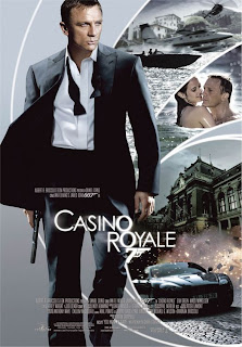
For our poster we decided to use the original image of the protagonist which was on the teaser poster. We decided to do this as a low/no budget film company it makes it easier for potential audiences to recognize our film as the image is repeated. We also added still shots from our actual trailer of the other characters. This is an inter-textual to the James Bond film Casino Royale.


We decided to re-do our poster as we wanted to create a new poster that didn't have the same image as the teaser poster. The steps we took to do this follow. We used a photo which is taken during the trailer to link into the narrative of the trailer.

We uploaded the image and 'adjusted' the image by making the photo brighter and changing the contrast levels.
We used the font 'impact' for the billing block and a font which we noticed was similar to the one's used in 'The Unborn' and 'Dark Ride' for the title font.

We weren't sure whether to have the tagline in a large or small size or for it to go over 2 lines. After writing them all out we compared them against each other and looking at other posters we chose to have the

smaller font.
The font used for the tagline is downloaded of a website which specialised in horror fonts. http://www.1001fonts.com/fonts_overview.html?page=1&category_id=14 we used this website as it had a special compatability with Mac computers.
We then started to add the reviews to the poster. One from a magazine Kingdom (which we created). One from a tabloid newspapper such as the Sun, Daily mail or the Mirror. Also, a quote from a famous figure such as Johnathan Ross as people may see his quote and as he is a respected character, take his word for it being a good film and therefore develop an interest in the film.

After showing our poster to our potential audience we decided it would look better if you could see the actors on the sofa but then have a black background behind them were we could add text and other images. So using the magic wand tool we edited out the background. Our audience feedback also told us to move the billing block to the bottom of the poster instead of the top as this is a common code and convention of horror posters.


We also decided we needed something to signify it is a horror genre(although the font used for the tagline is a specific horror font we thought we needed more) so we took a photo of a hooded figure, eyes and a hand holding a knife.


We took all 3 photos so we had a varied choice of photos we could use. We decided to use the hand holding a knife as this is a phallic object and links into the narrative of the trailer as one of the victims is killed with a knife. We didn't use the hooded figure as the image isn't dark enough and you can see too much of the actors face. The image of eyes is one that we used as is gives a aspect of msytery as you can only see her eyes and not the rest of her face, it also gives a sense of 'being watched' .
The updated poster with the billing block moved to the bottom, reviews at the top and the bloody hand holding a knife.

Above is our film poster.

Monday 14 December 2009

Coursework options

A promotion package for a new film including a teaser trailer between 30 seconds and 2 minutes; with the 2 following options:

  • A film magazine front cover
  • A poster for the film
Or

A short film lasting no more than 5 minutes, which can be live or animated work, with 2 of the 3 following options
  • A poster for the film
  • A radio for the film
  • A film magazine review featuring the film

 We decided we would make a teaser trailer as we thought it would be more challenging to produce than a short film as you have to be able to convey a story-line by showing aspects of the film using different characters and a variety of locations. Also, we have watched a lot more trailers generally from when there being advertised on television or trailers from the cinema. Furthermore, we thought that short films would be harder to access than trailers.

I think it is arguable whether a teaser trailer or a short film would give you more creativity for the production. Although if you look at the short film Ant Muzak http://www.youtube.com/watch?v=ZdgDTLW6-I8(2002 and Ben Gregor) and compared it to a teaser trailer Sex and the city 2 http://www.youtube.com/watch?v=XKQ5yRFkBnE(2010 Michael Patrick King) Then it would appear that a short film would give more scope for creativity than a trailer as the themes used in the short film tend to be alot more 'wackier' than those used in the Sex and the City trailer.

Definition of a teaser trailer.

"A teaser trailer, or teaser is a short trailer used to advertise an upcoming movie, game or television series.
Teasers, unlike typical theatrical trailers, are usually very short in length (between 30–60 seconds) and usually contain little if any actual footage from the film. Sometimes it is merely a truncated version of a theatrical trailer. They are usually released long in advance of the film they advertise."

Definition of a short film.
"The description can be used to describe any film that has a duration longer than one minute and shorter than 15 minutes. The North American definition also tends to focus much more on character whereas the European and Australasian forms tend to depend much more on visual drama and plot twists. In this way, the North American form can be understood to be a derivation of the feature film form, usually acting as a platform for aspirant Hollywood directors. Elsewhere, short films tend to work as showcases for cinematographers and commercial directors." 

Wednesday 2 December 2009

Logo


We decided on having a red dress as it is a key element used in our production as it signifies blood, death and love. Also, if we made another film this could be used again and we could use the same concept of a female killer. Another reason why we used a red dress is as we are a female production company, untypical in the film industry, our logo makes us stand out and be recognized within the industry.

Tuesday 1 December 2009

Film Magazine research


Empire is a film magazine that reviews mainstream and arts films but predominantly focuses on mainstream, more current new releases. You can also view the articles and extra features such as trailers that they recommend and daily movie news on the website therefore it is more current and up to date information than buying a monthly magazine, even-though the website is free to view and the magazine costs around £4.00 to buy. There is also links to be able to follow and join Empire groups on facebook and twitter.

Fangoria is a film magazine that focuses purely on Horror films and it is Americas longest running horror magazine. Initially, when Fangoria was first released it was based around a 'fantasy' concept and by issue 4 the publisher confinded the magazine was losing around $20,000 per issue. A young editor was employed who re-invented the magazine to be wholly based on the horror genre with the first magazine featuring The Shining (1980 Stanley Kubrick) The layout is still largely unchanged to this date.

Since 1985 Fangoria has sponsered annual horror movie conventions known as 'The Weekend of Horrors' in Los Angeles, New Jersey and Chicago.
Fangoria created Fangoria Films in 1990 with the goal of financing one feature film a year. The first film was Mindwarp in 1990. However in 1992 it ceased production but in 1996 it re-emerged as a distribution company.
In 1991 Fangoria started its annual Chainsaw Awards which  honours horror cinema. The films were voted for by the readers of their magazine however in 1996 the awards show was stopped although the awards carried on through the magazine.
Fangoria is also featured in films such as in Friday the 13th (1982 Steve Miner) were Debbie is reading Fangoria shortly before she dies. Also, in Death proof (2007 Quentin Tarentino) Fangoria is seen on a shelf in a shop. This is because Fangoria is a horror film so people with a horror interest  will also have an interest in Fangoria  although if they are unaware of Fangoria after seeing it featured in these films develop an interest in it.
http://en.wikipedia.org/wiki/Fangoria_(magazine)#Fangoria_Branches_Out

From researching into film magazines the majority of the front covers are similar. They are dominated by a photograph of the actor/actress who is in the film there advertising, this is used as it attracts the audience to look at the magazine especially if they have an interest in that character.
 There is also snippets such as '15 films you must see' and 'icons of the decade'. This gives anchorage to the audience of what else they will find in the magazine.
A number of fonts and sizes are used to give variation.
The date and issue number is also given.
Masthead goes across the top of the cover and the photo often covers part of masthead.
Background colours matches the genre of the film displayed on front.
Most have humour linked in to cover, or taglines.